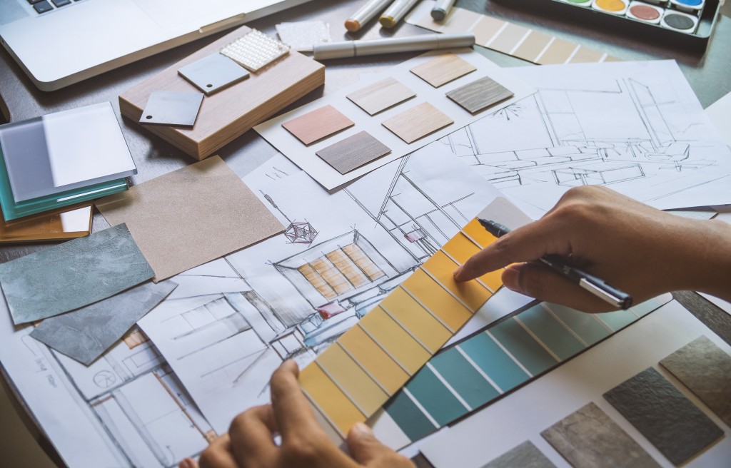
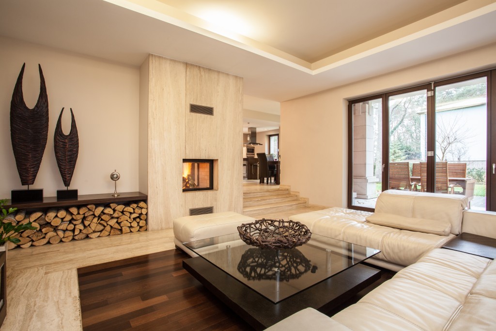
Furnishing is easily the best part in buying a home or remodeling. For some people who’d like to test their creativity, they may forego an interior designer. But as much as it is fun to design our own spaces, it can also be prone to blunders.
Looking at aesthetic Pinterest boards isn’t the only way to find design inspo. When you won’t hire professional help, you should at least obtain expert tips from them, such as the design mistakes to avoid. Learn all about them here, and the quick fixes you can do in case you’ve already committed them.
Flooring Mistakes
In a newly-built or an old home, the flooring is usually subject to change. When you’re choosing a new material, don’t immediately limit your options to what’s trendy. Consider its ability to withstand the test of time. Stripping off your flooring in the future just because it has gone out of style will be an impractical expense.
Hence, seek out a reputable contract flooring company, and explore your options with the experts. They’ll most probably recommend styles that lean on the more traditional side, but still appealing.
When choosing a tone or color, don’t be afraid of contrast. For instance, if your walls are light, you can definitely select a dark tone or color. Contrasting color schemes will add more life and interest to a space.
But go easy on the contrast when it comes to the bathroom. In such a space, it’s advised to use the same material, or closely similar shades. For instance, a sea-green wall tile paired with a charcoal gray one. They’re both cool-toned, so they complement and make the space feel lighter on the eye.
Using Matching Furniture
Just because matching furniture pieces look good in a showroom doesn’t mean it’ll be the same in your home. When you do this, your space will look flat and catalog-like, which is an eyesore for homes.
Instead, mix and match pieces to achieve an eclectic look. Doing so would make it appear as if your furniture are collected over time, and such is the best look in a room, according to interior designer max Humphrey.
The throw pillows shouldn’t match with the sofas as well. Use different colored and textured pillow cases to make an accent, and to add dimension.

Leaving the Lighting Incomplete
Typical homes would just have overhead lights, and a maybe lamp or two. While functional, your space is totally capable of being more than such. Thus, add task lighting such as table lamps and floor lamps, and some mood lighting from different angles.
But if you’re on a budget, you can just swap out your ordinary overhead bulbs for dimmable ones. That way, you can bathe your space in a warmer and more inviting glow.
Using Drapes of the Wrong Length
Ideally, an inch or two of the drapes’ hems should touch the floor. If your drapes are too short, you can either replace them with the proper ones, or just take down altogether. The bare look wouldn’t be so bad, as it will fill your space with beautiful natural light.
Choosing the Wrong Area Rug Size
It has become a common practice to choose an area rug that’s big enough for the front legs of the furniture to sit on top of. While this does look pretty, it actually defeats the purpose of an area rug.
Area rugs are used to section off a space, so it should extend beyond the front legs of the furniture. Simply put, they should be wider than the furniture’s width.
Fix these common interior design mistakes gradually, so you can stay within your budget. But if you’re ready to perform a drastic home makeover, be sure to note these tips to avoid making mistakes again.

